
You know your workforce and probably have a pretty good understanding of what motivates them. You may even have a recognition program aimed at improving performance and developing a culture of recognition. With that in mind, you may be asking why your time and efforts spent on recognition haven’t seemed to have the effect you initially anticipated.
Before we explore options to improve your recognition program, let’s consider the colors and color combinations you use on your awards. From colored accents to corporate logos – all should be considered thoughtfully to increase the probability of motivating your employees to reach their fullest potential.
In this case, we’re not just taking into account your corporate branding. We’re going further by bringing up the topic of color psychology in awards.
I think most of us know that color has aesthetic qualities. That means when certain colors are combined well together, they can and do create beautiful works of art. You only need to look at a beautiful image of a forest in the fall to understand how color can have a soothing effect on our minds.

Calming and serene, this image is an excellent example of the use and power of Color Psychology.
What is Color Psychology?
Wikipedia states that Color Psychology is the study of hues as a determinant of human behavior. As a manufacturer of acrylic awards, we often state, that “used right color can excite” and in contrast, “color gone astray they look okay”.
Keeping those statements in mind, let’s dive deeper into the Psychology of Color, and how it can impact the effectiveness of your incentive programs like how your team reacts to awards presented.
How color can impact the effectiveness of incentive programs.
First and foremost, it’s important to note that peer recognition often contributes to a boost in work relationships, improved employee confidence, increased self-esteem, and enhanced work performance. Each is beneficial to the success of any organization that relies heavily on their workforce.
Optimizing a recognition program begins with understanding its purpose, then developing a sustainable model focused on results. It’s those anticipated results coupled with the purpose that should always include a discussion about color.
Colors and color values can have different effects on an individual. Here’s a simple chart with how colors can affect a person's perception.

It’s quite interesting to see how colors can make a difference in human perception.
Optimizing for your team’s reaction to award programs
It’s important to note that colors often affect demographics like gender and age differently. Knowing that men and women can have different psychological responses to colors – the blending of colors is often important when balancing the aesthetic benefits of color with program goals, corporate logos, and branding.
Rarely will you find a workforce that’s either all men or all women and as we mentioned above, finding the right balance of color that appeals to both genders should be of primary importance when designing and integrating corporate brands into your recognition gifts.
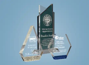
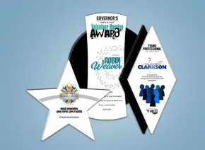
Here are a few good suggestions to take into consideration during the design process using black as a solid base.
Black
A very good base color often used for appreciation text on awards in conjunction with laser engraving. Since most corporate logos use a tint of black – ensure that the black you choose is the same as required in your corporate graphic standards.
Black + Red is exciting and bold
Black + Orange is exciting, inviting, and warm
Black + Yellow offers a stable blend of satisfaction and competence
Black + Green is earthy with hint of wealth
Black + Blue offers a reliable corporate look of quality
Remember there are multiple tints of red, orange, yellow, green, and blue – finding the correct tint to enhance your event or company logo is very important to the overall appearance of your finished product.
Remember to request a proof of your awards prior to production to ensure the look achieves your goals. When you see your full color proof – take note of how the design makes you feel. If that initial response corresponds with the intention of your program you have a winner.
How to add color to acrylic awards
There are multiple ways of adding color to acrylics. Here we’re going to take a look at the most common manufacturing techniques – plus the results and benefits of each.
 Screen printing
Screen printing has been around for over 1000 years – originally developed in China and then adopted by other countries over centuries of time. Today, modern screen printing uses a screen mesh coated with a photo polymer that uses light to harden and block out specific areas that should not allow ink to pass through. Ink is then pushed through the mesh to the substrate to be printed. Each color requires its own screen to produce multiple colors.
 Direct Printing
Probably the most common and growing in popularity with the introduction of UV (ultraviolet) printers – direct printing is capable of reproducing digital graphics in full color on acrylic awards. Often combined with laser cutting to create custom contoured awards – UV printing is a durable, more accurate, less costyly, and faster alternative to screen printing.
 Flood printing
Back printing acrylic can achieve a few different effects. Using UV ultraviolet printing technologies, we can achieve a translucent effect that when combined with light enhances laser engraving to its fullest potential. Printing images in conjunction with a back flood print often creates a 3D effect depending on the thickness of the acrylic substrate used.
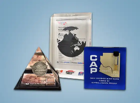
 Color casting
Casting colors into acrylic is a science all itself. You can learn more about acrylic casting from our Making Embedments page. Color casting involves the mixing of acrylic monomers and polymers to create a Lucite® compound whereby colored acrylic accents are gracefully suspended into crystal clear acrylic. One of the most frequently used forms of color casting is when we use blue acrylic as a backer to enhance police service badges in the casting process. Check out the short video below that shows the embedment process from beginning to end.
From stone looking Staron® to over 28 accent colors – casting accents into acrylic creates a one-of-a-kind look when coupled with corporate logos and event images.

 Tinting acrylic
Tinting is a step often done during the casting process wherein a pigment is added to the mixture of Lucite® monomer and polymer prior to pouring into the molds. Pigments come in multiple color options and can be combined to create custom colors.
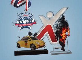
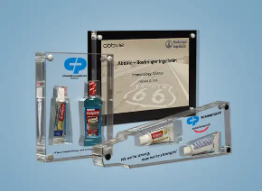
 Acrylic accents
Combining multiple acrylic components into an award often involves colored acrylic accent pieces designed to highlight and enhance the engraved or printed areas on the award. Often used in the manufacturing of Deal Toys – acrylic accents give depth and an impression of high value.
Conclusion
It’s easy to be in a hurry to get a job done. In this case, you want to rush to get the awards ordered and check it off the list. But it's important to remember you’re ordering awards with the intention of impacting your workforce in a positive way.
When choosing your color scheme, be an active participant in the design process. You know your corporate brand and you should share your graphic standards with the designer – including fonts, colors, and spacing to make sure the final outcome adheres to your brand.
Color offers a powerful alternative to traditional clear acrylic awards and finding the right blend of colors can have a significant impact on the psychological effect of your recognition program.
US Acrylic Awards offers an amazing selection of full colored acrylic awards in blue, red, green, yellow, orange, purple, grey and most importantly since we are the manufacturer, we can custom tint to your specifications as needed. Give us a call if you have questions about adding color to your awards – we’re always up for a challenge.
Written by noptim… unleash the power


